
YÖOPS KIOSK
This project aimed to create a strong connection between the existing brand identity and a new spatial format by translating the concept from a traditional storefront into a kiosk.

the concept
The design reinterprets the brand’s core elements through a modern language, ensuring the space remains recognizable, cohesive, and engaging for both the brand and its customers.
This form is derived from an abstraction of the “ö” found in the brand’s logo, reinforcing brand identity through a contemporary architectural expression.
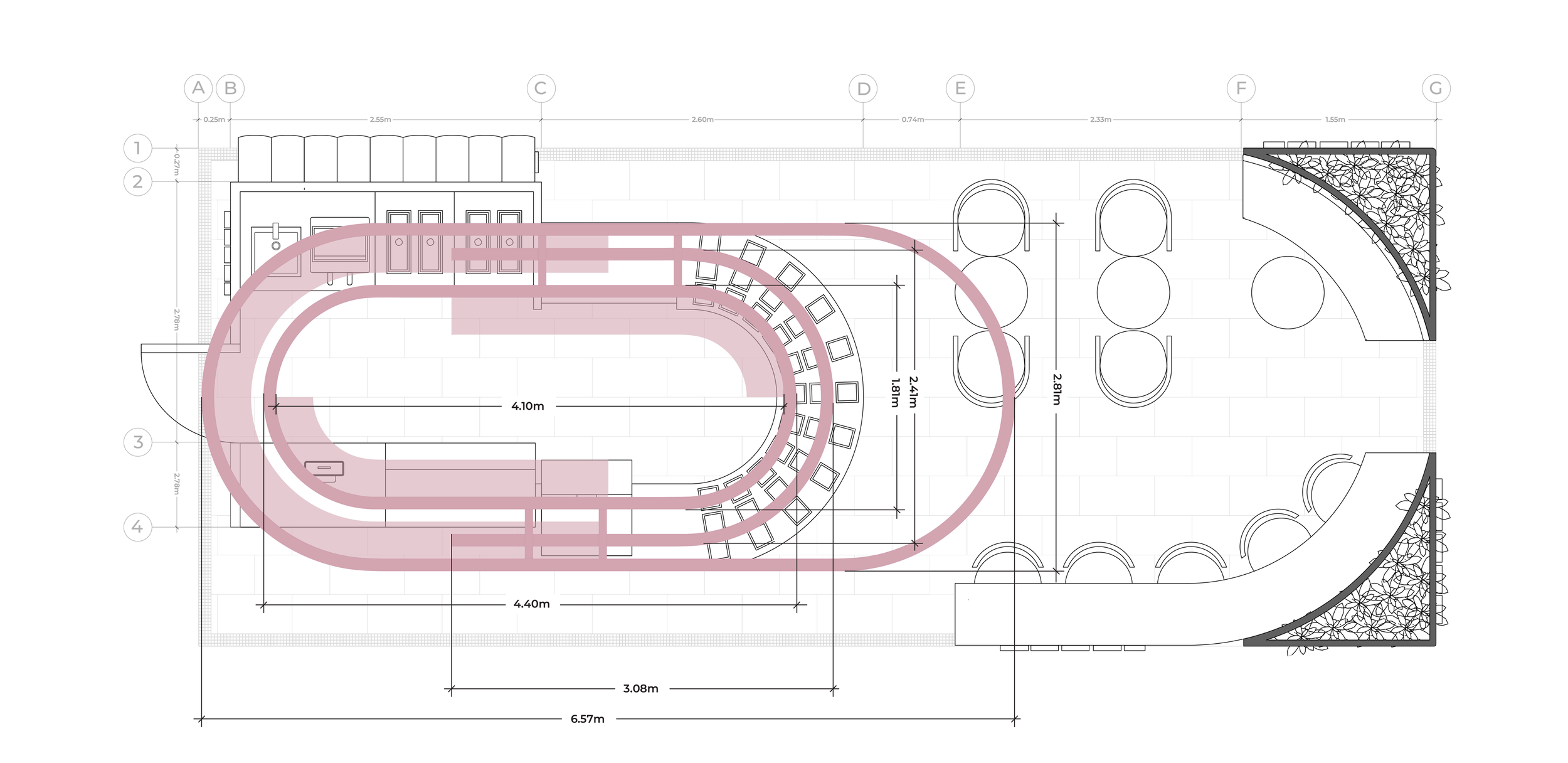
One of the main constraints of the project was the shopping mall’s regulations, which required the elevation to remain visually open and non-solid. In response, the design introduces metal oval structures combined with pink acrylic transparencies, allowing lightness and permeability while maintaining visual impact.
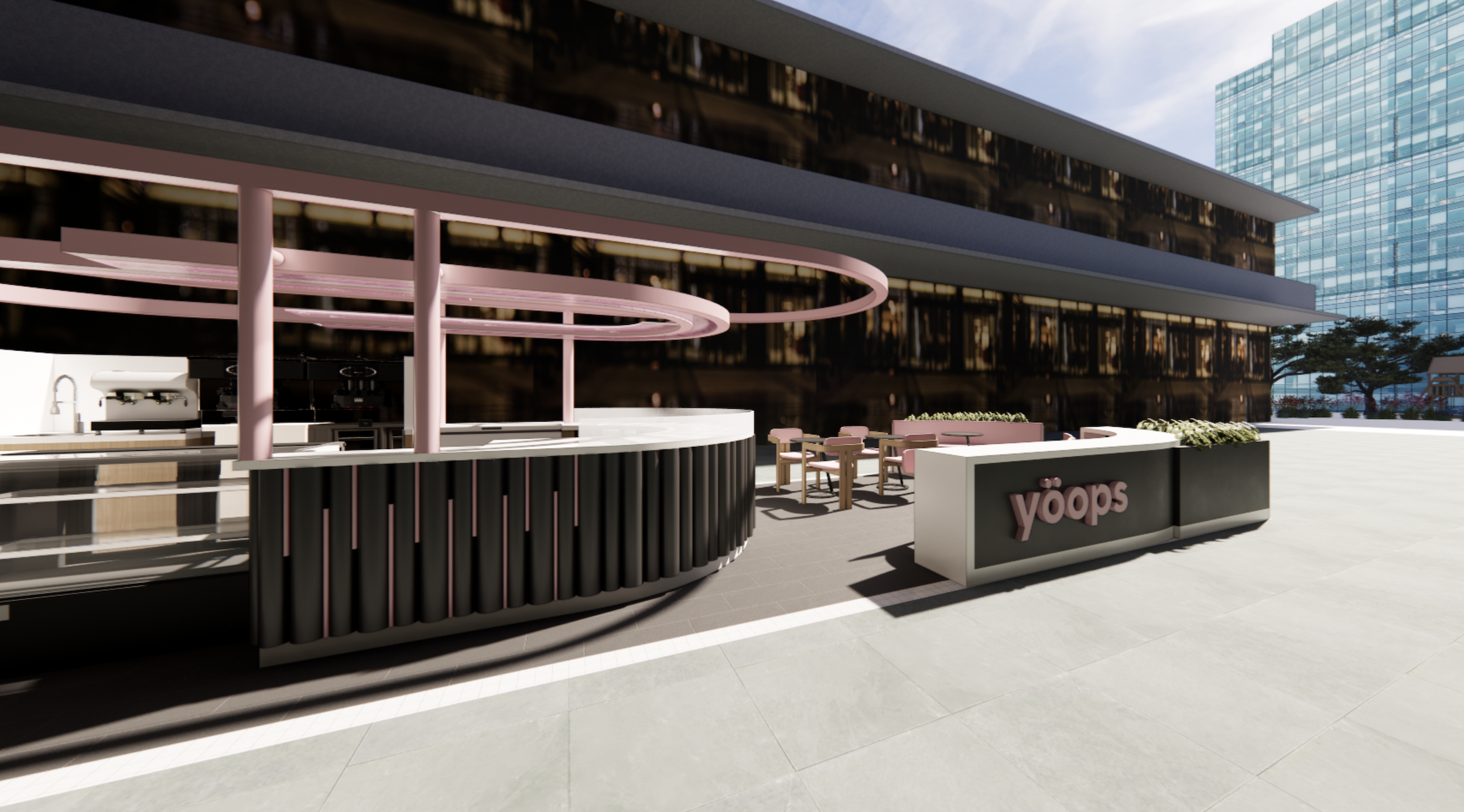
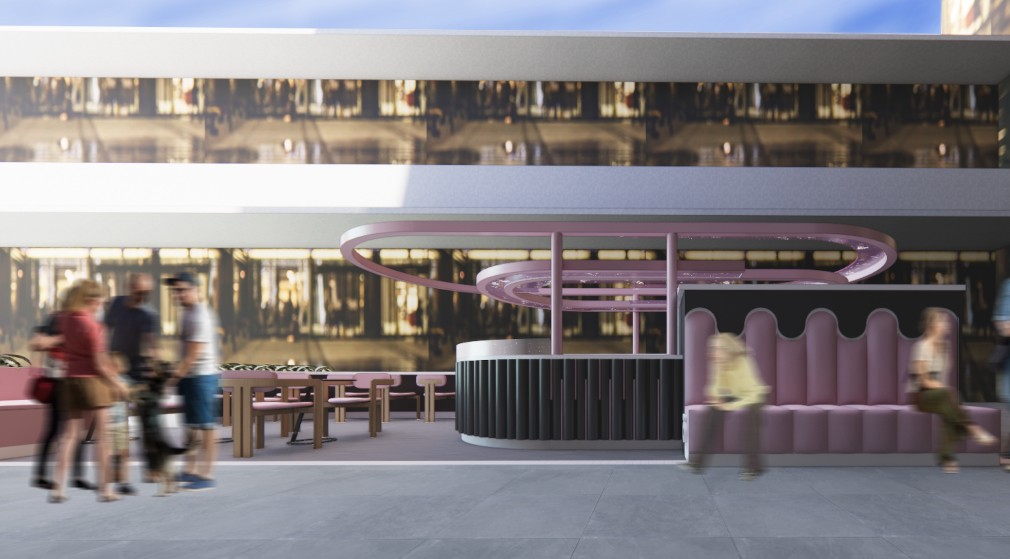
In terms of materiality, the design incorporates elements already present in the brand’s existing locations, such as metal tubing, acrylics, and metal finishes. These are complemented by gray porcelain flooring and light wood surfaces to balance warmth and neutrality.
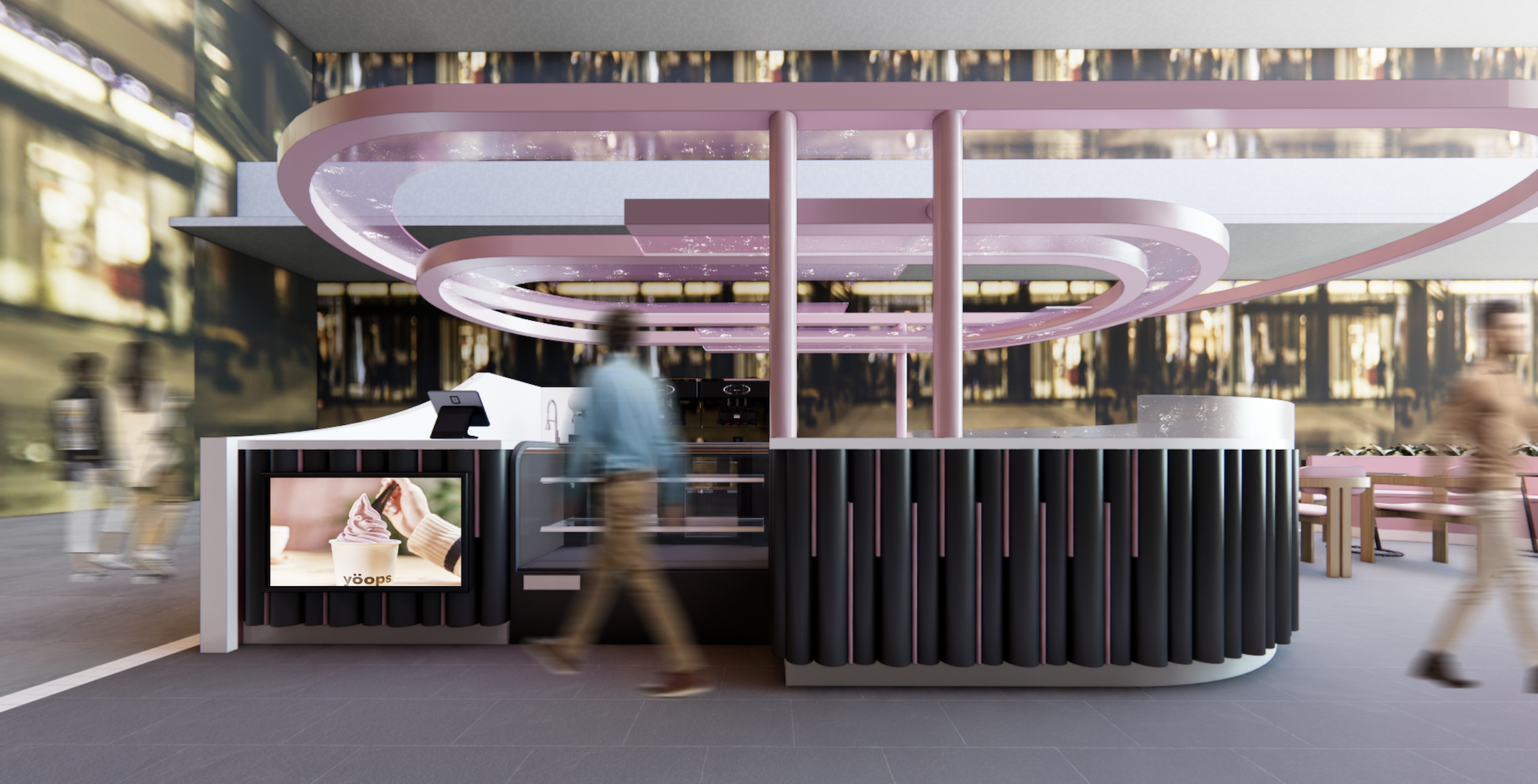
In terms of materiality, the design incorporates elements already present in the brand’s existing locations, such as metal tubing, acrylics, and metal finishes. These are complemented by gray porcelain flooring and light wood surfaces to balance warmth and neutrality.